1k Savings and Loan App Design and Brand
Freelance Design, 2018-2019
60% of Americans can’t come up with $1000 in an emergency.
Whether it's a car problem, a surprise medical bill, or a job loss, many of our neighbors turn to paycheck advance stores or loans with sharp penalties. This in turn drives many further into debt, creating a tough financial situation that's a big fear for those living paycheck to paycheck.
Brought on as a creative partner to this startup idea, I helped a pair of friends give form and personality to their savings and loan app that would optimally help solve this issue.
Named "1k", the business aimed to immediately provide access to $1000 whenever a user would need it with non-profit loans. The app would then help them save up $1000 of their own so they never have to take out a short-term loan again (even from the 1k business. We then refer them to good financial products to build long-term financial health.
"Don't other businesses address this Issue?"
We wanted to be a go-to app for lower-income users looking to improve their overall financial health, which was gap in the market at the time.
Brand Look
The prompt was to make a personable yet trustworthy set of visuals to a finance brand, standing out amongst the common trends of loaners.
The logo paired with illustrations to show that the loans would come with friendlier terms than payday lenders or larger institutions who may be critical of those with low credit. The loans could be spent with freedom, symbolized by the many different substitutions for the numeral. Other illustrations carried the same colors, line patterns, and active illustrations.
Simple animation showing how the logo integrates with illustrations
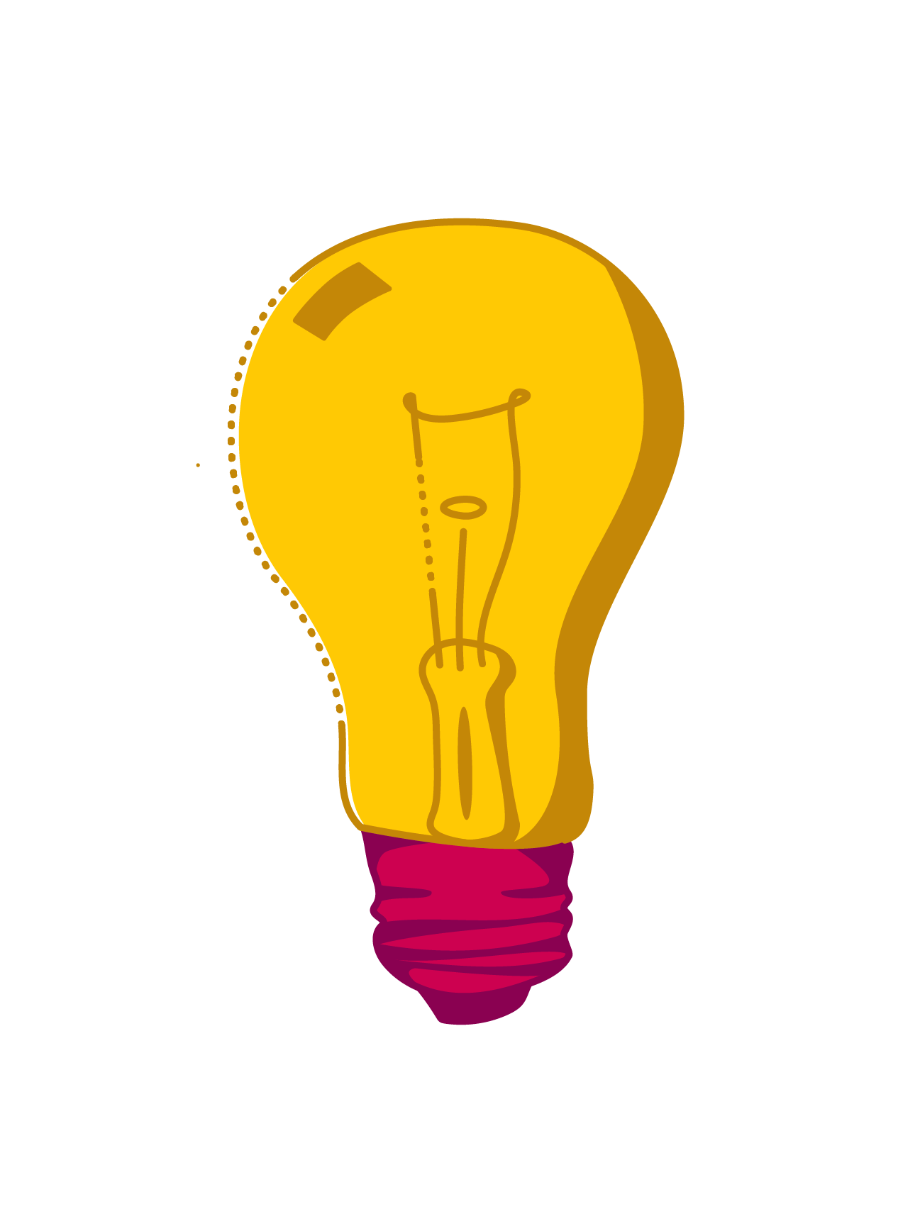
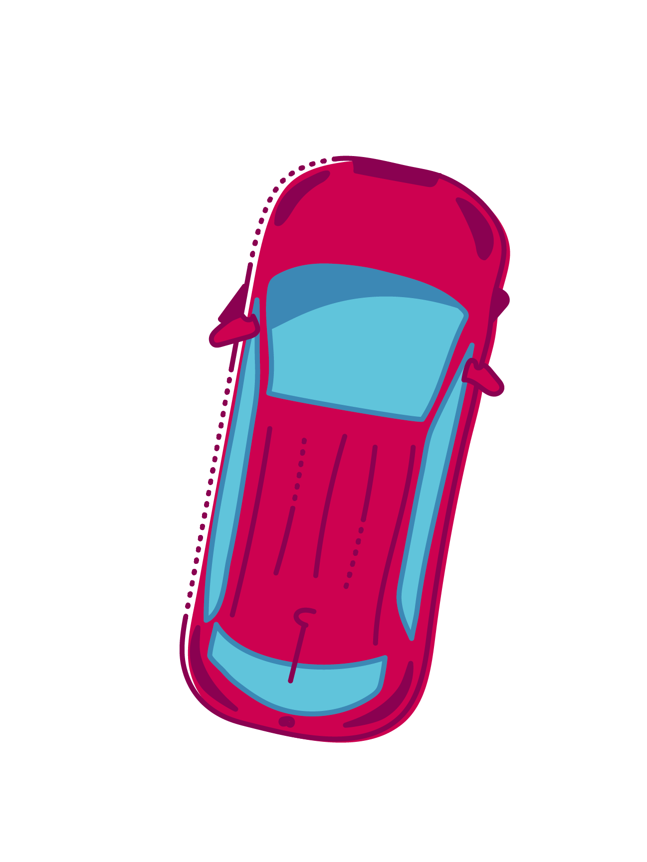

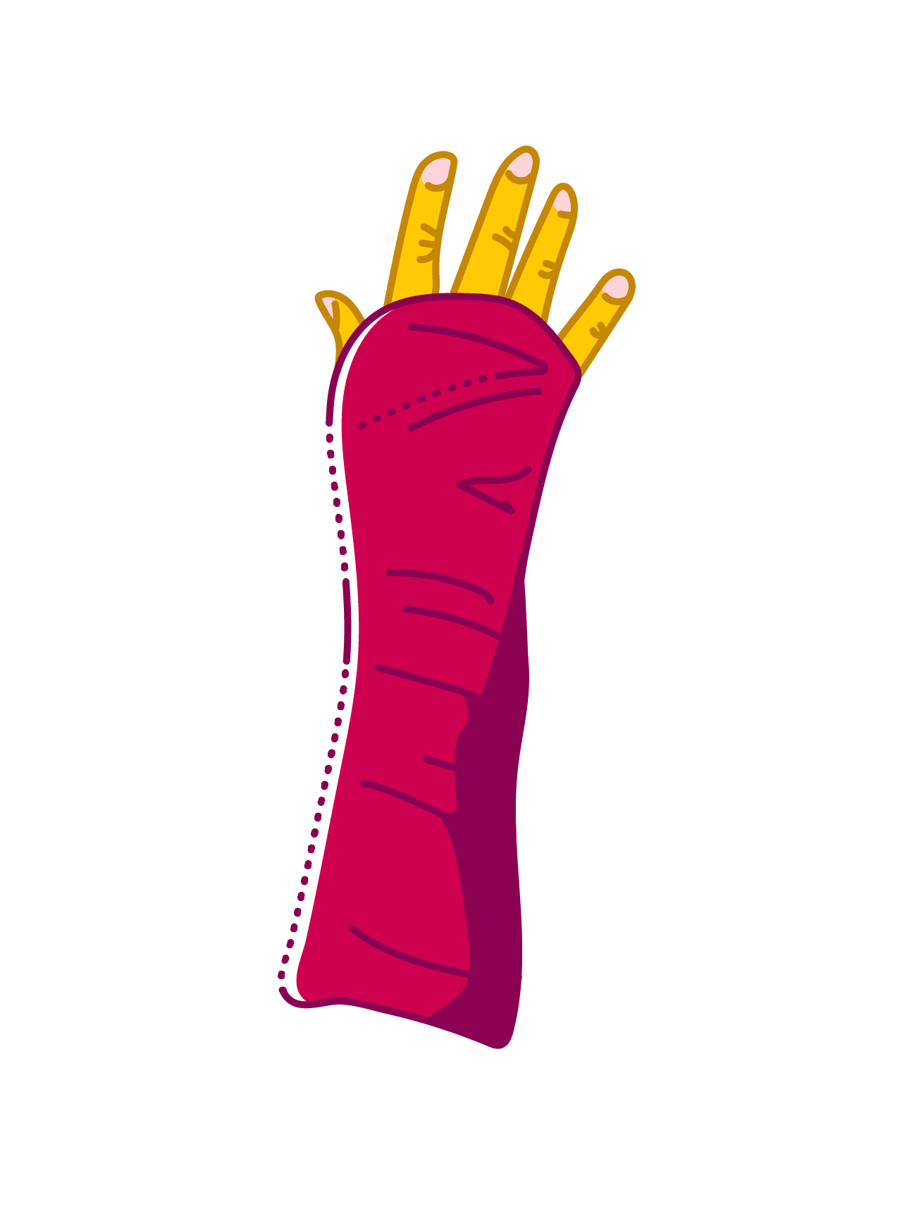
Capabilities of the logo, which naturally fits in a single square, accepting color fills and illustrations
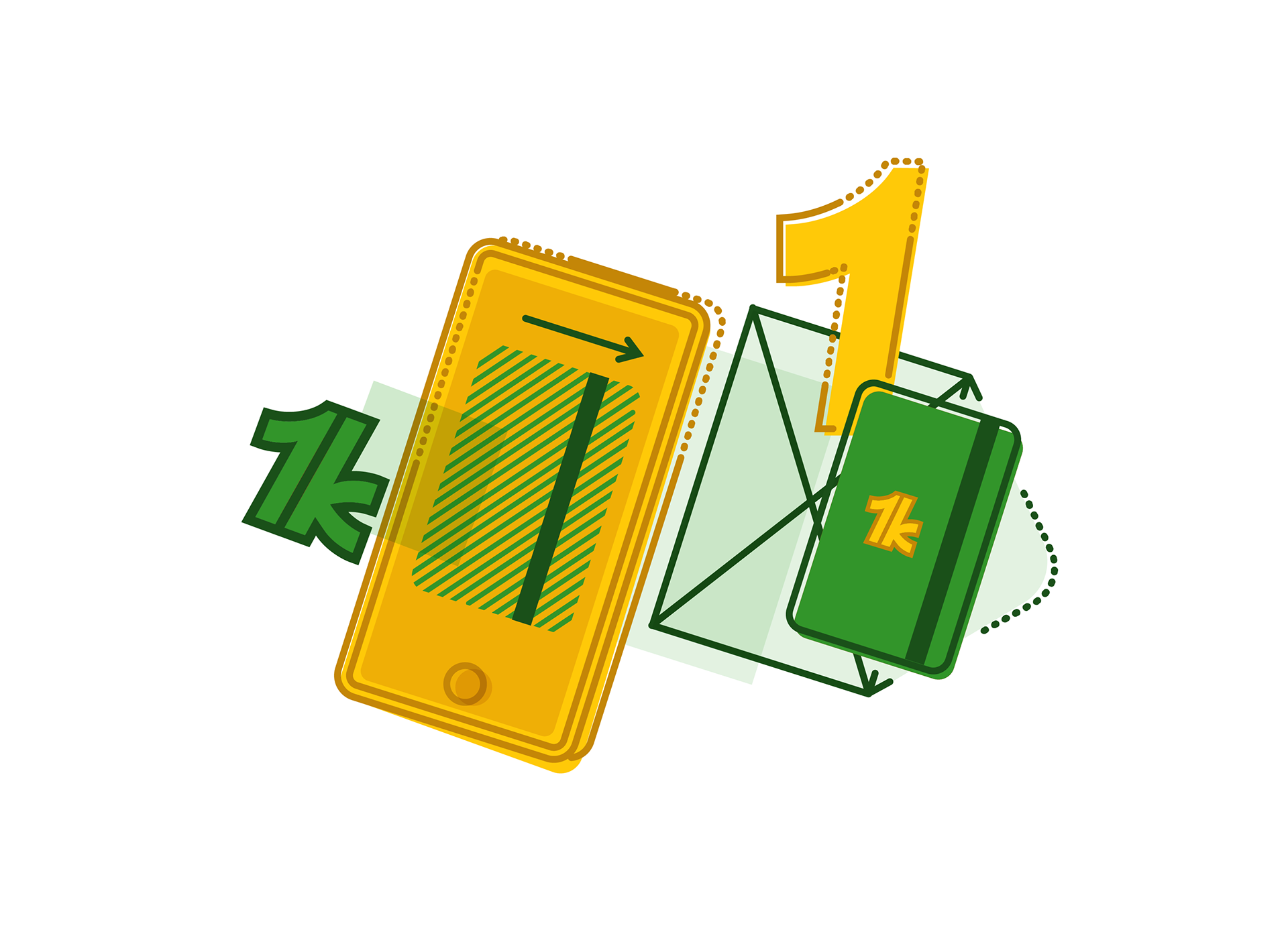
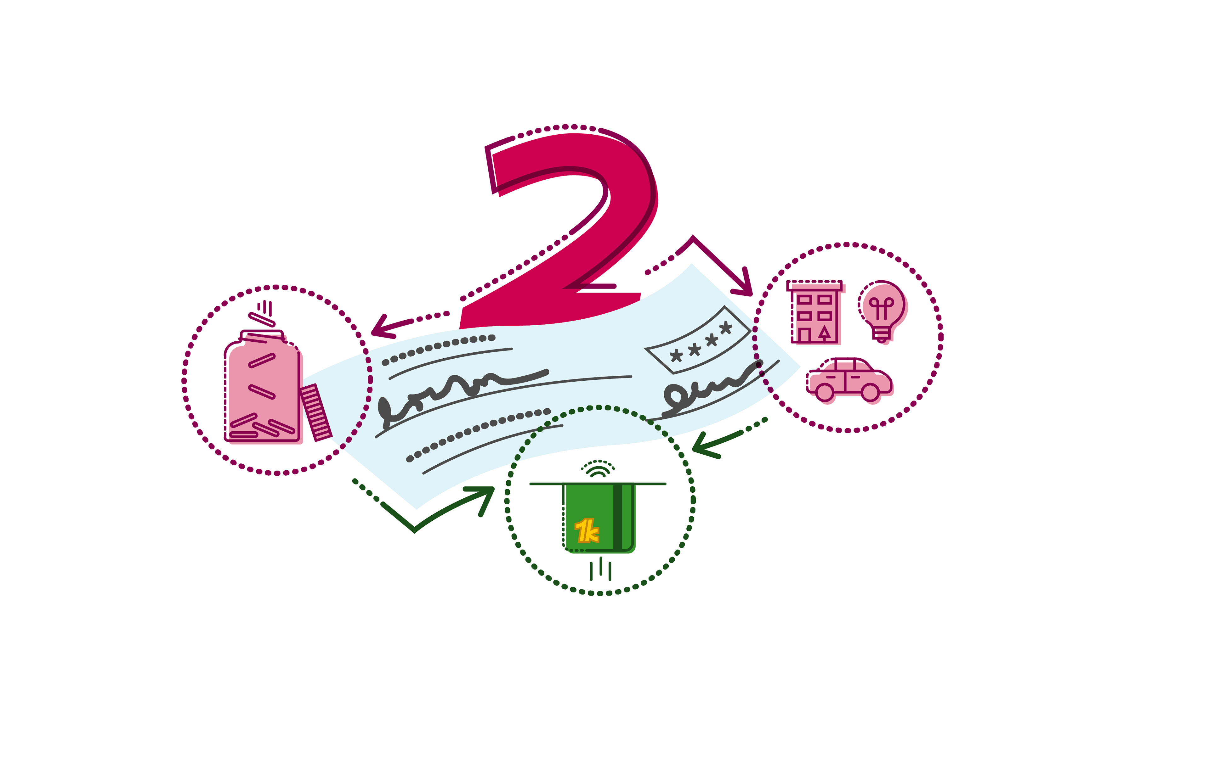
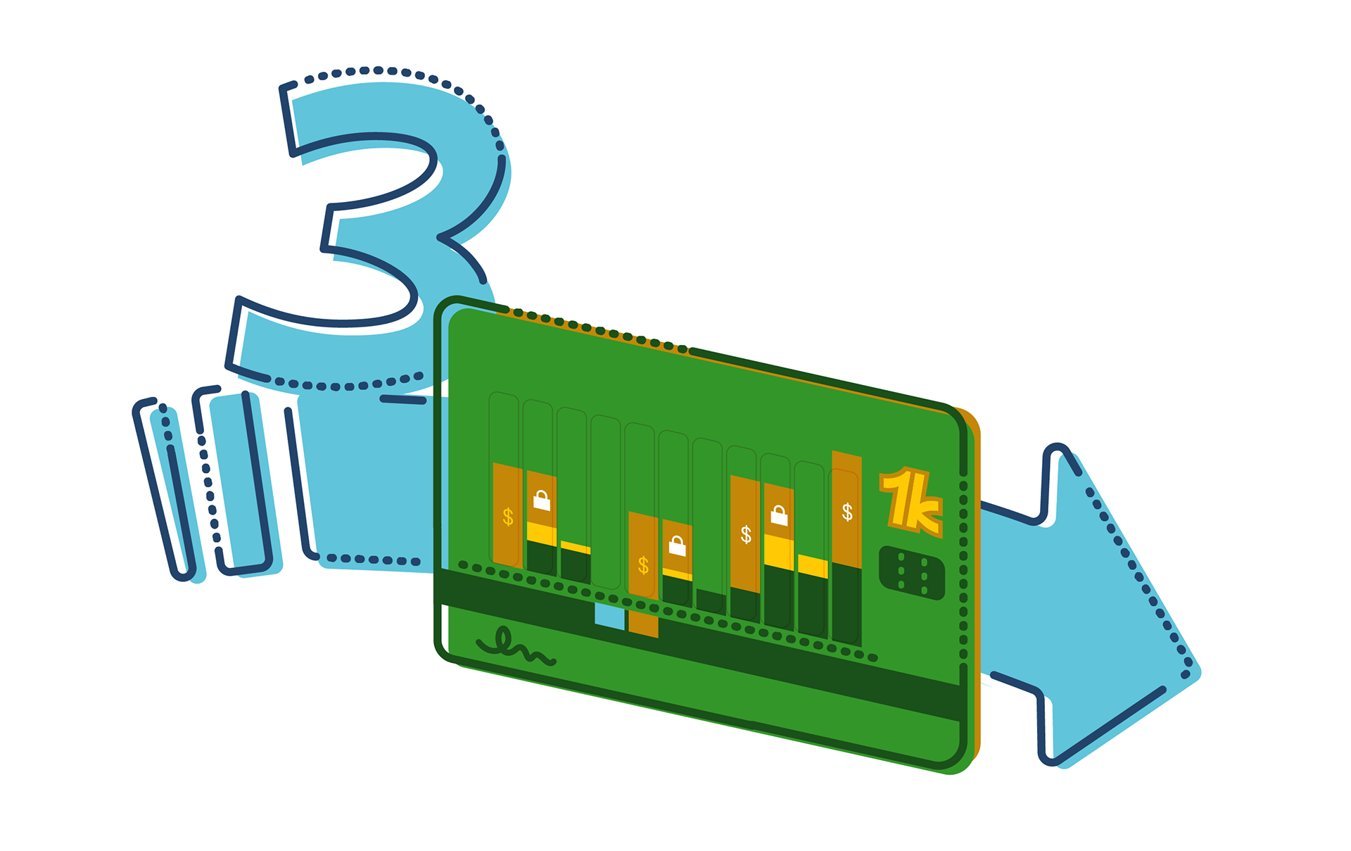
Additional icons explored during ideation.
Example Features
In order to pitch the business, we created a prototype of the two core functions of the app:
1. Creating an account, taking a loan, and spending the loan.
2. Analyzing a direct deposit check to illustrate the best path for savings and payments.
Our team created wireframes in Balsamiq and hand sketching, which I then worked over in Sketch and directly shared drafts in InVision.
Drafts for incorporating branding into the home screen
Sketches of potential dashboards and tutorial screens
The core functions of the app are represented through two accounts: Spending, that has an associated card, and Savings. Most users would be drawn to the app when in need of loans, so the home page illustrates these accounts as well as the $1000 that would always be available to them.
Research revealed that many low-income users are very adept at tracking and maintaining their budgets, so our goal of assisting them with their financial health comes primarily through integrated estimation tools and summaries of their spending to save them time.
These tools also serve a secondary audience of middle-income young adults looking for easier methods of tracking their finances and saving for an emergency fund.
Check out the app prototype here or through the QR code below on a mobile device.
An InVision walkthrough of the app's core functions.
Pilot Program
Understandably, most folk are skeptical of new financial businesses, which made gathering user research a challenge. In order to walk new users through a framework that would be a proof of concept, we created a step-by-step guide that would create the same system of savings advice and accounts through existing and trusted applications. By signing up users and surveying their opinions of the system's effectiveness (despite the hoops they needed to go through), we were able to obtain feedback about potential features and bypass the issues of trust in a new apps.
Check out the app prototype here or through the QR code below on a mobile device.
An InVision walkthrough of the pilot program guide
We also set up a separate site that modeled the paycheck analyzer function that would be integrated into savings account of the app. This was to give our pilot project a web presence and contact information, hopefully establishing more trust with the users we were reaching out to.
